Gourmet Catering
How to Create a Catering Web Page
This example shows how to build a responsive catering website with W3.CSS.
The layout uses modern Flexbox and Grid together with W3.CSS classes.
Create a Skeleton
Start with the page structure, the fonts and a responsive image.
Use a display container to place a heading on top of the image.
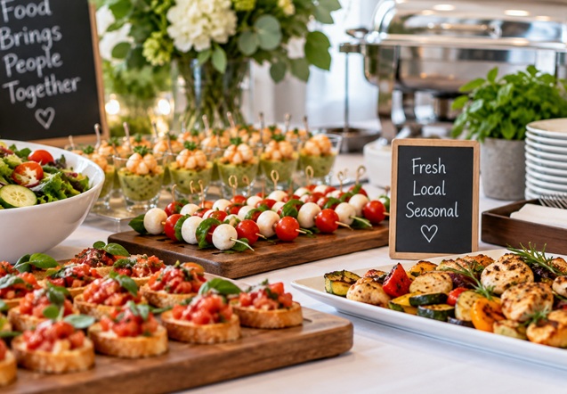
Le Catering
Skeleton
<html lang="en">
<title>Catering</title>
<meta name="viewport" content="width=device-width,initial-scale=1">
<link rel="stylesheet" href="https://www.w3schools.com/w3css/5/w3.css">
<style>
body {font-family:"Times New Roman", serif}
h1,h2,h3,h4,h5,h6 {font-family:serif;letter-spacing:5px}
</style>
<body>
<!-- Page Content -->
<div id="home" class="w3-content" style="max-width:1000px">
<header class="w3-display-container">
<img src="img_catering.jpg"
style="width:100%" alt="Catering">
<div class="w3-display-bottomleft w3-padding w3-text-white w3-opacity-min">
<h1>Le Catering</h1>
</div>
</header>
</div>
<!-- End Content -->
</body>
</html>
Try it Yourself »
Add Navigation
Use Flexbox to keep the site name on the left and the navigation links on the right.
Navigation
<!-- Navbar (Sits on top) -->
<div class="w3-flex w3-top w3-white w3-wide w3-padding w3-card">
<a href="#home" class="w3-button">Gourmet au Catering</a>
<nav class="w3-flex w3-hide-small" style="margin-left:auto">
<a href="#about" class="w3-button">About</a>
<a href="#menu" class="w3-button">Menu</a>
<a href="#contact" class="w3-button">Contact</a>
</nav>
</div>
Try it Yourself »
The margin-left:auto style pushes the navigation links to the right.
Add About
Use CSS Grid for the image and the About text.
The columns automatically stack when there is not enough room.
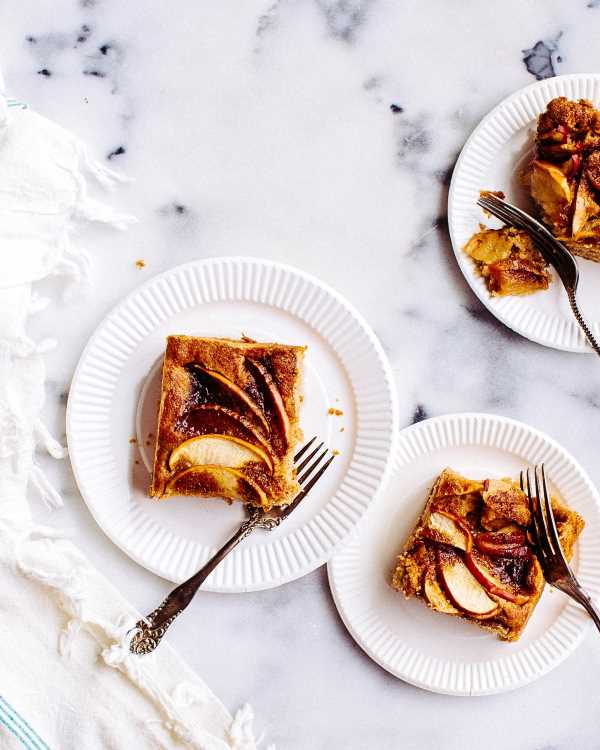
About Catering
Tradition since 1889
The Catering was founded in blabla by Mr. Smith in lorem ipsum dolor sit amet, consectetur adipiscing elit consectetur adipiscing elit, sed do eiusmod tempor incididunt ut labore et dolore magna aliqua.
Excepteur sint occaecat cupidatat non proident, sunt in culpa qui officia deserunt mollit anim id est laborum consectetur adipiscing elit.
<section id="about" class="w3-grid w3-padding-64"
style="grid-template-columns:repeat(auto-fit,minmax(300px,1fr))">
<div class="w3-padding-large">
<img src="img_tablesetting2.jpg"
class="w3-round w3-opacity-min"
style="width:100%" alt="Table">
</div>
<div class="w3-padding-large">
<h1 class="w3-center">About Catering</h1>
<h5 class="w3-center">Tradition since 1889</h5>
<p class="w3-large">
The Catering was founded in blabla by Mr. Smith...
</p>
<p class="w3-large w3-text-grey">
Excepteur sint occaecat cupidatat non proident...
</p>
</div>
</section>
Try it Yourself »
The minmax(300px,1fr) rule keeps each column at least 300 pixels wide when there is enough space..
Add a Menu
Use the same Grid pattern for the menu and its image.
Our Menu
Bread Basket
Assortment of fresh baked fruit breads and muffins 5.50
Belgian Waffle
Vanilla flavored batter with malted flour 7.50
Scrambled Eggs
Scrambled eggs, roasted red pepper and garlic, with green onions 7.50
Blueberry Pancakes
With syrup, butter and lots of berries 8.50
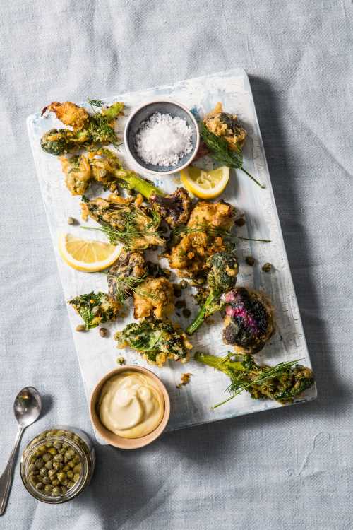
Menu
<section id="menu" class="w3-grid w3-padding-64"
style="grid-template-columns:repeat(auto-fit,minmax(300px,1fr))">
<div class="w3-padding-large">
<h1 class="w3-center">Our Menu</h1>
<h4>Bread Basket</h4>
<p class="w3-text-grey">
Assortment of fresh baked fruit breads and muffins 5.50
</p>
<h4>Belgian Waffle</h4>
<p class="w3-text-grey">
Vanilla flavored batter with malted flour 7.50
</p>
<h4>Scrambled Eggs</h4>
<p class="w3-text-grey">
Scrambled eggs, roasted red pepper and garlic, with green onions 7.50
</p>
<h4>Blueberry Pancakes</h4>
<p class="w3-text-grey">
With syrup, butter and lots of berries 8.50
</p>
</div>
<div class="w3-padding-large">
<img src="img_tablesetting.jpg"
class="w3-round w3-opacity-min"
style="width:100%" alt="Menu">
</div>
</section>
Try it Yourself »
Add Contact
Add contact information and a simple form.
Contact
Catering Service, 42nd Living St, 43043 New York, NY
You can also contact us by phone 00553123-2323 or email catering@catering.com, or send us a message here:
Contact
<section id="contact" class="w3-container w3-padding-64">
<h1>Contact</h1>
<p class="w3-text-blue-grey w3-large">
<b>Catering Service, 42nd Living St, 43043 New York, NY</b>
</p>
<p>You can also contact us by phone 00553123-2323 or email
catering@catering.com, or send us a message here:</p>
<form action="/action_page.php" target="_blank">
<p><input class="w3-input w3-padding-16"
type="text" placeholder="Name" required name="Name"></p>
<p><input class="w3-input w3-padding-16"
type="number" placeholder="How many people"
required name="People"></p>
<p><input class="w3-input w3-padding-16"
type="datetime-local" required name="date"></p>
<p><input class="w3-input w3-padding-16"
type="text" placeholder="Message / Special requirements"
required name="Message"></p>
<p><button class="w3-button w3-light-grey w3-section"
type="submit">SEND MESSAGE</button></p>
</form>
</section>
Try it Yourself »
The Complete Web Page
The completed page uses different W3.CSS tools for different layout jobs:
| Part | Layout |
|---|---|
| Navigation | Flexbox |
| Header | Display classes |
| About | Grid |
| Menu | Grid |
| Contact | Normal document flow |