
W3.CSS Responsive
Responsive Web Design
Responsive web design makes web pages look good on all devices.
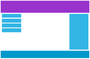
Desktop

Tablet

Phone
Responsive web design is about using CSS and HTML to resize, hide, shrink, enlarge, or move web content to make a page look good on any screen size.
Web pages can be viewed using many different devices: desktops, tablets, and phones. Your web page should look good, and be easy to use, regardless of the device size.
W3.CSS includes classes for creating responsive layouts for small, medium, and large screens.
W3.CSS Responsive Classes
| Class | Description |
|---|---|
| w3-content | Container for fixed size centered content |
| w3-auto | Container for responsive size centered content |
| w3-hide-small | Hides content on small screens (less than 601px) |
| w3-hide-medium | Hides content on medium screens |
| w3-hide-large | Hides content on large screens (larger than 992px) |
| w3-image | Makes an image responsive |
| w3-mobile | Displays elements as block elements on mobile devices |
Responsive Page Width
Responsive page width refers to a web layout technique where the width of a web page (and the elements inside it), automatically adjusts, scales, and rearranges itself to fit any screen size or device.
Instead of freezing a webpage at a fixed width (like width: 1200px), W3.CSS uses fluid layouts so the page looks great on everything from a small mobile phone to a wide desktop monitor.
The w3-auto Class
w3-auto
The w3-auto class defines a container for responsive size centered content.
It has a width of 95% on large screens, and a fixed width of 1140px for screens wider than 1205px.
On medium and small screens the max-width is changed to 100%.
Resize the browser window to see the effect.
The w3-content Class
w3-content
The w3-content class creates a centered page with a
maximum width.
Use the CSS max-width property to override the default width (980px).
On smaller screens, the content automatically adjusts to the available width.
Resize the window to see the effect.
W3.CSS 2026
Examples
<div class="w3-auto">
<h2>My Page</h2>
</div>
Try it Yourself »
<div class="w3-content">
<h2>My Page</h2>
</div>
Try it Yourself »
The w3-mobile Class
The w3-mobile class adds mobile-first responsiveness to any element.
It displays its element as a block with width:100%
on screens less than 600px wide.
London
Paris
Tokyo
Example
<div class="w3-cell-row">
<div class="w3-cell w3-mobile">London</div>
<div class="w3-cell w3-mobile">Paris</div>
<div class="w3-cell w3-mobile">Tokyo</div>
</div>
Try it Yourself »
Responsive Visibility
W3.CSS provides classes for showing and hiding content at different screen sizes.
| Class | Description |
|---|---|
w3-hide-small |
Hides content on small screens |
w3-hide-medium |
Hides content on medium screens |
w3-hide-large |
Hides content on large screens |
Responsive Images
The w3-image class makes images responsive.
The image scales down to fit its container when necessary.
Responsive Layout Options
W3.CSS provides several ways to create responsive layouts.
| Layout | Best For |
|---|---|
| CSS Grid | Flexible two-dimensional and automatically responsive layouts. |
| Flexbox | Flexible one-dimensional layouts and alignment. |
| Rows | Simple responsive halves, thirds, and quarters. |
| Cells | For creating simple, table-like column layouts. |
| 12-column grid | Different column widths for small, medium, and large screens. |
w3-mobile |
Letting side by side columns stack vertically on small screens. |
There is no single layout method that is best for every page.
Choose the method that makes the layout simplest to understand and maintain.