
Architect Web Page
How to Create an Architect Web Page
This example shows how to build a responsive architect website with W3.CSS.
The layout uses modern Flexbox and Grid together with W3.CSS classes.
Create a Skeleton
Start with a navigation bar and a large header image.

BR
Skeleton
<body class="w3-content" style="max-width:1500px">
<!-- Navbar (sits on top) -->
<div class="w3-flex w3-top w3-white w3-wide w3-padding w3-card">
<a href="#home" class="w3-button">
<b>BR</b> Architects
</a>
<nav class="w3-flex w3-hide-small" style="margin-left:auto">
<a href="#projects" class="w3-button">Projects</a>
<a href="#about" class="w3-button">About</a>
<a href="#contact" class="w3-button">Contact</a>
</nav>
</div>
<!-- Header -->
<header id="home" class="w3-display-container">
<img src="/w3images/architect.jpg"
style="width:100%" alt="Architecture">
<div class="w3-display-middle">
<h1 class="w3-text-white w3-wide">
<span class="w3-padding w3-black w3-opacity-min"><b>BR</b></span>
<span class="w3-hide-small w3-text-light-grey">Architects</span>
</h1>
</div>
</header>
<!-- Projects -->
<!-- About -->
<!-- Contact -->
</body>
Try it Yourself »
Note
The navigation uses w3-flex to keep the logo on the left and the links on the right.
Add Projects
CSS Grid makes the project gallery automatically adapt to the available width.
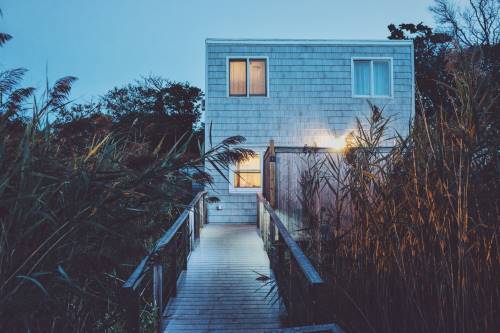

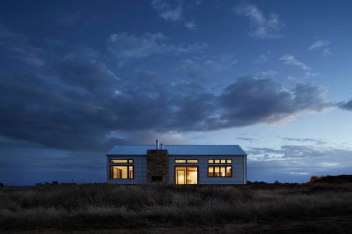
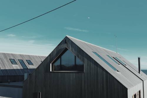
Projects
<section id="projects" class="w3-container w3-padding-32">
<h2 class="w3-border-bottom w3-border-light-grey w3-padding-16">Projects</h2>
<div class="w3-grid" style="grid-template-columns:repeat(auto-fit,minmax(300px,1fr));gap:16px">
<div class="w3-display-container">
<div class="w3-display-topleft w3-black w3-padding">Summer House</div>
<img src="/w3images/house5.jpg"
style="width:100%" alt="Summer House">
</div>
<div class="w3-display-container">
<div class="w3-display-topleft w3-black w3-padding">Brick House</div>
<img src="/w3images/house2.jpg"
style="width:100%" alt="Brick House">
</div>
<div class="w3-display-container">
<div class="w3-display-topleft w3-black w3-padding">Renovated</div>
<img src="/w3images/house3.jpg"
style="width:100%" alt="Renovated House">
</div>
<div class="w3-display-container">
<div class="w3-display-topleft w3-black w3-padding">Barn House</div>
<img src="/w3images/house4.jpg"
style="width:100%" alt="Barn House">
</div>
</div>
</section>
Try it Yourself »
The w3-grid automatically creates as many columns as will fit.
Each project is at least 300 pixels wide.
Add About
The same responsive Grid pattern works well for the team members.

John Doe
CEO & Founder
Phasellus eget enim eu lectus faucibus vestibulum.

Jane Doe
Architect
Phasellus eget enim eu lectus faucibus vestibulum.

Mike Ross
Architect
Phasellus eget enim eu lectus faucibus vestibulum.

Dan Star
Architect
Phasellus eget enim eu lectus faucibus vestibulum.
About
<section id="about" class="w3-container w3-padding-32">
<h2 class="w3-border-bottom w3-border-light-grey w3-padding-16">About</h2>
<div class="w3-grid w3-grayscale" style="grid-template-columns:repeat(auto-fit,minmax(300px,1fr));gap:16px">
<div>
<img src="/w3images/team2.jpg"
style="width:100%" alt="John">
<h3>John Doe</h3>
<p class="w3-opacity">CEO & Founder</p>
<p>Phasellus eget enim eu lectus faucibus vestibulum.</p>
<p><button class="w3-button w3-light-grey w3-block">Contact</button></p>
</div>
<div>
<img src="/w3images/team1.jpg"
style="width:100%" alt="Jane">
<h3>Jane Doe</h3>
<p class="w3-opacity">Architect</p>
<p>Phasellus eget enim eu lectus faucibus vestibulum.</p>
<p><button class="w3-button w3-light-grey w3-block">Contact</button></p>
</div>
<div>
<img src="/w3images/team3.jpg"
style="width:100%" alt="Mike">
<h3>Mike Ross</h3>
<p class="w3-opacity">Architect</p>
<p>Phasellus eget enim eu lectus faucibus vestibulum.</p>
<p><button class="w3-button w3-light-grey w3-block">Contact</button></p>
</div>
<div>
<img src="/w3images/team4.jpg"
style="width:100%" alt="Dan">
<h3>Dan Star</h3>
<p class="w3-opacity">Architect</p>
<p>Phasellus eget enim eu lectus faucibus vestibulum.</p>
<p><button class="w3-button w3-light-grey w3-block">Contact</button></p>
</div>
</div>
</section>
Try it Yourself »
Add Contact
Let's get in touch and talk about your next project.
Contact
<section id="contact" class="w3-container w3-padding-32">
<h2 class="w3-border-bottom w3-border-light-grey w3-padding-16">Contact</h2>
<p>Let's get in touch and talk about your next project.</p>
<form action="/action_page.php" target="_blank">
<input class="w3-input w3-border" type="text"
placeholder="Name" required name="Name">
<input class="w3-input w3-section w3-border" type="email"
placeholder="Email" required name="Email">
<input class="w3-input w3-section w3-border" type="text"
placeholder="Subject" required name="Subject">
<input class="w3-input w3-section w3-border" type="text"
placeholder="Comment" required name="Comment">
<button class="w3-button w3-black w3-section" type="submit">
SEND MESSAGE
</button>
</form>
</section>
Try it Yourself »

The Complete Web Page
The completed page uses different W3.CSS tools for different layout jobs:
| Part | Layout |
|---|---|
| Navigation | Flexbox |
| Header | Display classes |
| Projects | Grid |
| Team | Grid |
| Contact | Normal document flow |