Menu
×
   ❮     
HTML CSS JAVASCRIPT SQL PYTHON JAVA PHP HOW TO W3.CSS C C++ C# BOOTSTRAP REACT MYSQL JQUERY EXCEL XML DJANGO NUMPY PANDAS NODEJS DSA TYPESCRIPT ANGULAR GIT POSTGRESQL MONGODB ASP AI R GO KOTLIN SASS VUE GEN AI SCIPY CYBERSECURITY DATA SCIENCE INTRO TO PROGRAMMING BASH RUST

CSS Tutorial

CSS HOME CSS Introduction CSS Syntax CSS Selectors CSS How To CSS Comments CSS Errors CSS Colors CSS Backgrounds CSS Borders CSS Margins CSS Padding CSS Height/Width CSS Box Model CSS Outline CSS Text CSS Fonts CSS Icons CSS Links CSS Lists CSS Tables CSS Display CSS Max-width CSS Position CSS Z-index CSS Overflow CSS Float CSS Inline-block CSS Align CSS Combinators CSS Pseudo-classes CSS Pseudo-elements CSS Opacity CSS Navigation Bars CSS Dropdowns CSS Image Gallery CSS Image Sprites CSS Attr Selectors CSS Forms CSS Counters CSS Website Layout CSS Units CSS Specificity CSS !important CSS Math Functions CSS Performance CSS Accessibility

CSS Advanced

CSS Rounded Corners CSS Border Images CSS Backgrounds CSS Colors CSS Color Keywords CSS Gradients CSS Shadows CSS Text Effects CSS Web Fonts CSS 2D Transforms CSS 3D Transforms CSS Transitions CSS Animations CSS Tooltips CSS Image Styling CSS Image Centering CSS Image Filters CSS Image Shapes CSS object-fit CSS object-position CSS Masking CSS Buttons CSS Pagination CSS Multiple Columns CSS User Interface CSS Variables CSS @property CSS Box Sizing CSS Media Queries CSS MQ Examples

CSS Flexbox

Flexbox Intro Flex Container Flex Items Flex Responsive

CSS Grid

Grid Intro Grid Columns/Rows Grid Lines Grid Container Grid Item CSS @supports

CSS Responsive

RWD Intro RWD Viewport RWD Grid View RWD Media Queries RWD Images RWD Videos RWD Frameworks RWD Templates

CSS SASS

SASS Tutorial

CSS Examples

CSS Templates CSS Examples CSS Editor CSS Snippets CSS Quiz CSS Exercises CSS Website CSS Syllabus CSS Study Plan CSS Interview Prep CSS Bootcamp CSS Certificate

CSS References

CSS Reference CSS Selectors CSS Combinators CSS Pseudo-classes CSS Pseudo-elements CSS At-rules CSS Functions CSS Reference Aural CSS Web Safe Fonts CSS Animatable CSS Units CSS PX-EM Converter CSS Colors CSS Color Values CSS Default Values CSS Browser Support

CSS Vertical Navigation Bar


CSS Vertical Navigation Bar

In a vertical navigation bar, the navigation links are stacked vertically (on top of each other), and is typically aligned along the left or right side of a webpage.

The basics of a vertical navigation bar is an unordered list (<ul>), with list items (<li>), each holding a link (<a>), as shown in the Navbar Intro page.


CSS Vertical Navbar Example

Here, we create a basic vertical navigation bar with a gray background color, and we also change the background color and the text color of the links when the user mouse over them:

Example

ul {
  list-style-type: none;
  margin: 0;
  padding: 0;
  width: 200px;
  background-color: #f1f1f1;
}

li a {
  display: block;
  color: black;
  padding: 8px 16px;
  text-decoration: none;
}

/* Change the link and background color on hover */
li a:hover {
  background-color: #555555;
  color: white;
}
Try it Yourself »

Example explained:

  • The first block (ul)  is similar to the previous page. In addition we have specified a fixed width (200px) and a light gray background color
  • The next block (li a) styles <a> elements inside <li> elements
  • Displaying the links as block elements makes the whole link area clickable (not just the text), and allows us to specify width, padding, margin, height, etc. We add a link color and some padding. We also remove the underline from these <a> elements
  • The last block (li a:hover) changes the link color and background color when a user mouse over them


Active State

Now we add an "active" class to highlight the link corresponding to the current page to let the user know which page/section he/she is on:

Example

.active {
  background-color: #04AA6D;
  color: white;
}
Try it Yourself »

Center Navbar Links & Add Borders

To center the navbar links, add text-align: center; to <li> or <a>.

If you want a border around the navbar, add the border property to <ul>.

If you also want borders inside the navbar, add a border-bottom property to all <li> elements, except for the last one:

Example

ul {
  border: 1px solid #555555;
}

li {
  text-align: center;
  border-bottom: 1px solid #555555;
}

li:last-child {
  border-bottom: none;
}
Try it Yourself »

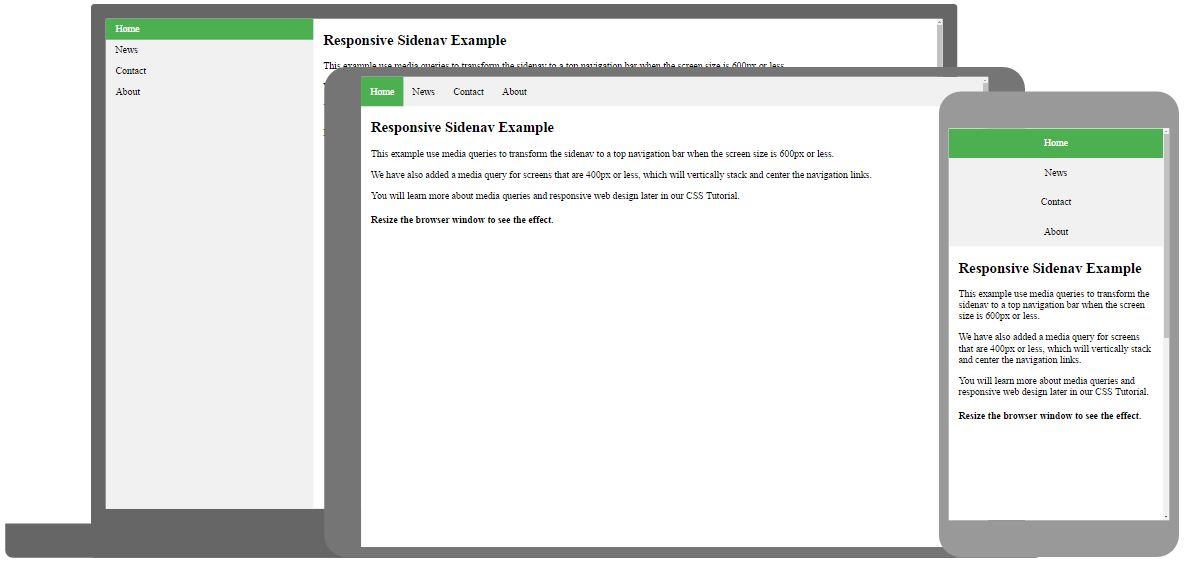
Full-height Vertical Navbar

Create a full-height, "sticky" side navigation:

Example

ul {
  list-style-type: none;
  margin: 0;
  padding: 0;
  width: 130px;
  background-color: #f1f1f1;
  height: 100%; /* Full height */
  position: fixed; /* Make it stick, even on scroll */
  overflow: auto; /* Enable scrolling if the sidenav has too much content */
}
Try it Yourself »

Note: This example might not work properly on mobile devices.


Responsive Navbar

Example

How to use CSS media queries to create a responsive navbar:

Responsive Navbar
Try it Yourself »

×

Contact Sales

If you want to use W3Schools services as an educational institution, team or enterprise, send us an e-mail:
sales@w3schools.com

Report Error

If you want to report an error, or if you want to make a suggestion, send us an e-mail:
help@w3schools.com

W3Schools is optimized for learning and training. Examples might be simplified to improve reading and learning. Tutorials, references, and examples are constantly reviewed to avoid errors, but we cannot warrant full correctness of all content. While using W3Schools, you agree to have read and accepted our terms of use, cookie and privacy policy.

Copyright 1999-2025 by Refsnes Data. All Rights Reserved. W3Schools is Powered by W3.CSS.