CSS Image Gallery
CSS Image Gallery
A CSS image gallery is a collection of images that is displayed in an organized, and often responsive way, on a web page.
Here we use CSS to create an image gallery:
Cinque Terre
Green Forest

Northern Lights

Mountains
The HTML structure for an image gallery is:
- A container element to wrap the entire gallery (like a <div> with class="gallery").
- Another container element for each image (like a <div> with class="gallery-item"), that contains the <img> tag and possibly a description.
Here is the HTML and CSS code:
Example
<html>
<head>
<style>
div.gallery {
display: flex;
flex-wrap:
wrap;
justify-content: flex-start;
}
div.gallery-item {
margin: 5px;
border: 1px solid #ccc;
width: 180px;
}
div.gallery-item:hover {
border: 1px solid #777;
}
div.gallery-item img {
width: 100%;
height: auto;
}
div.gallery-item div.desc {
padding: 15px;
text-align:
center;
}
</style>
</head>
<body>
<div class="gallery">
<div class="gallery-item">
<a
target="_blank" href="img_5terre.jpg">
<img
src="img_5terre.jpg" alt="Cinque Terre" width="600" height="400">
</a>
<div class="desc">Cinque Terre</div>
</div>
<div
class="gallery-item">
<a target="_blank" href="img_forest.jpg">
<img src="img_forest.jpg" alt="Forest" width="600" height="400">
</a>
<div class="desc">Green Forest</div>
</div>
<div class="gallery-item">
<a target="_blank" href="img_lights.jpg">
<img
src="img_lights.jpg" alt="Northern Lights" width="600" height="400">
</a>
<div class="desc">Northern Lights</div>
</div>
<div class="gallery-item">
<a target="_blank" href="img_mountains.jpg">
<img
src="img_mountains.jpg" alt="Mountains" width="600" height="400">
</a>
<div class="desc">Mountains</div>
</div>
</div>
</body>
</html>
Try it Yourself »
Tip: We have used display: flex;
for the image gallery above. This layout module is effective for arranging
images in rows or columns. You will learn more about
CSS Flexbox later in our CSS Tutorial.
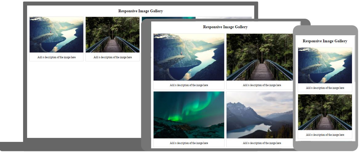
CSS Responsive Image Gallery
Here we use CSS media queries to re-arrange the images on different screen sizes:
- If screen is larger than 768px wide - show four images side by side
- If screen is smaller than 768px - show two images side by side
- If screens is smaller than 480px - stack the images vertically (width: 100%)
Tip: You will learn more about media queries later in our CSS Tutorial.